May 26, 2026
Choosing the right aesthetic for the heart of your home involves more than just picking a shade that looks pleasant in a showroom. It requires a deep understanding of light, texture, and how various tones interact within a confined space. The process is often overwhelming because the kitchen serves as a multipurpose hub for cooking, socializing, and relaxing. Finding a balance between trendy and timeless is the primary goal for most homeowners looking to refresh their environment.
Many people begin this journey by searching for professional guidance to ensure their vision aligns with practical application. Expert cabinet designers often suggest looking at the permanent fixtures in your room before committing to a specific paint or stain. Your flooring, backsplash, and countertops provide the foundation upon which your cabinetry color will sit. By coordinating with these existing elements, you create a cohesive visual narrative that feels intentional and sophisticated.
Assessing Your Kitchen Lighting
Natural light plays a pivotal role in how a pigment appears once it is applied to wooden surfaces. A deep navy might look regal in a kitchen with floor-to-ceiling windows, yet the same shade could make a smaller, windowless galley feel cramped and cave-like. Before finalizing a choice, it is wise to observe how sunlight moves through the room during various parts of the day. Morning light tends to be cooler and bluer, while afternoon sun brings out warmer, yellow undertones.
To truly understand how a color behaves, you should request samples and place them in different corners of the room. This allows you to see how shadows interact with the grain and finish. If your space lacks sufficient windows, you may want to lean toward lighter palettes that reflect artificial light, making the area feel more expansive. Darker tones are better suited for rooms with high ceilings and abundant sunshine, where the intensity of the color can be properly balanced.
Selecting a Design Style
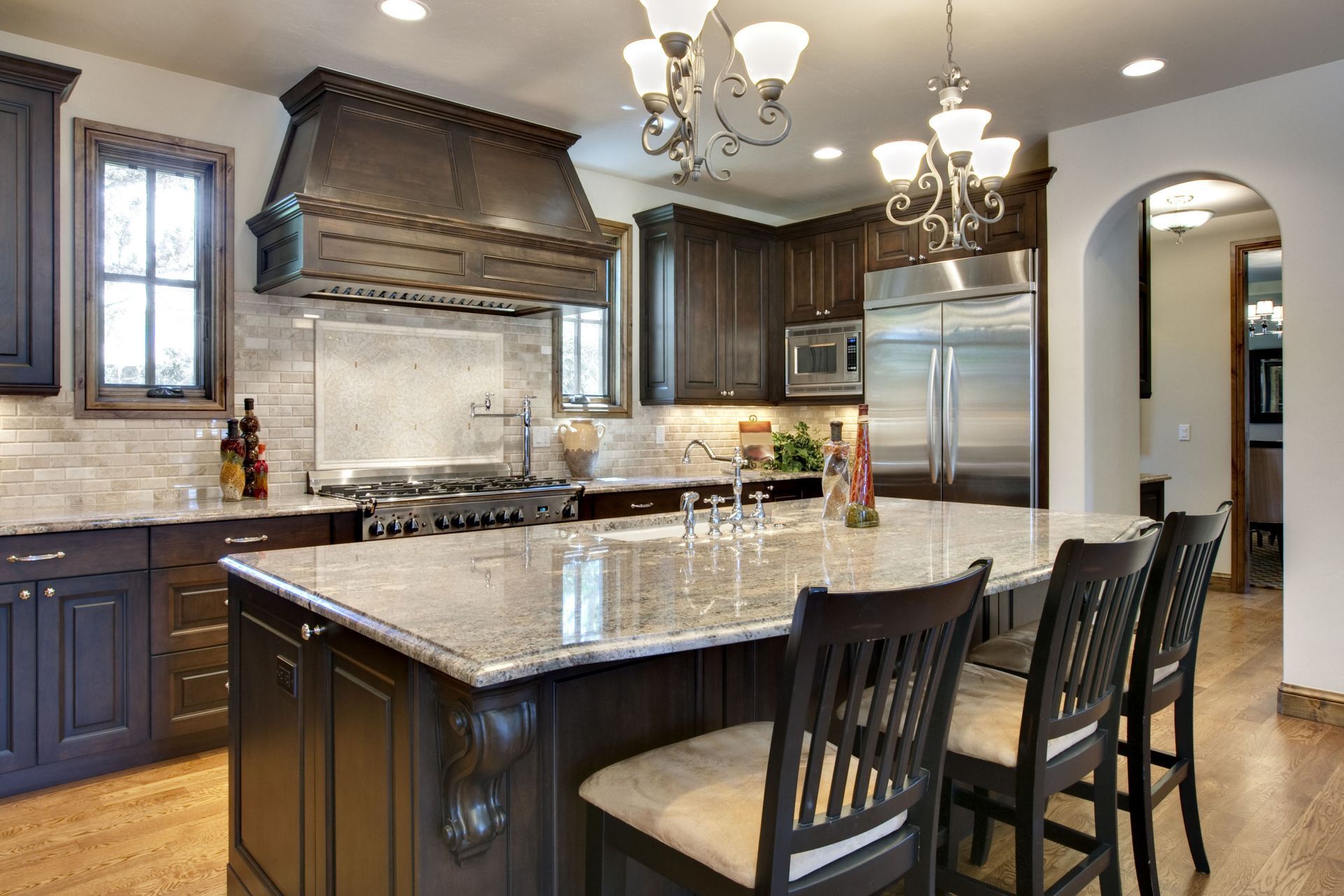
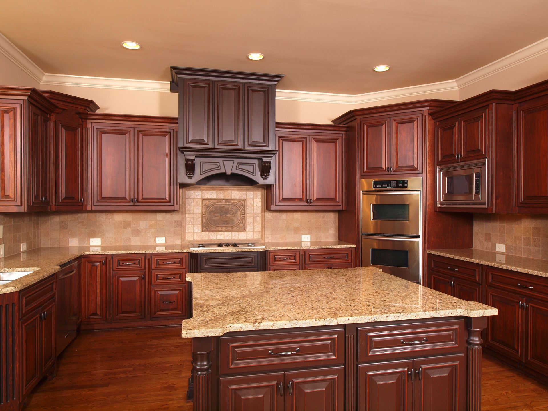
The architectural style of your home should influence your cabinetry decisions. A sleek, modern apartment often calls for high-gloss finishes or bold, monochromatic palettes like charcoal or soft grey. Conversely, a rustic farmhouse or a traditional suburban home might benefit from creamy whites, earthy greens, or natural wood stains that highlight the organic beauty of the material. Aligning your cabinets with the overall theme of the house ensures a seamless transition between rooms.
When you work with cabinet designers, they often help you narrow down these styles by showing how different door profiles react to color. A flat-panel door looks vastly different in matte black than a raised-panel door does. Texture also plays a role; a visible wood grain adds a layer of complexity to a color that a smooth, painted finish cannot replicate. Consider the mood you want to evoke — excitement, serenity, or warmth — and choose a style that reflects that emotion.
Considering Long-Term Resale Value
While bold colors like emerald green or terracotta are currently popular in interior design magazines, it is important to think about the longevity of your investment. A kitchen renovation is a significant undertaking, and most homeowners do not want to repaint or replace their cabinetry every few years to keep up with shifting trends. Neutral colors have historically provided the best return on investment because they appeal to a wider range of tastes.
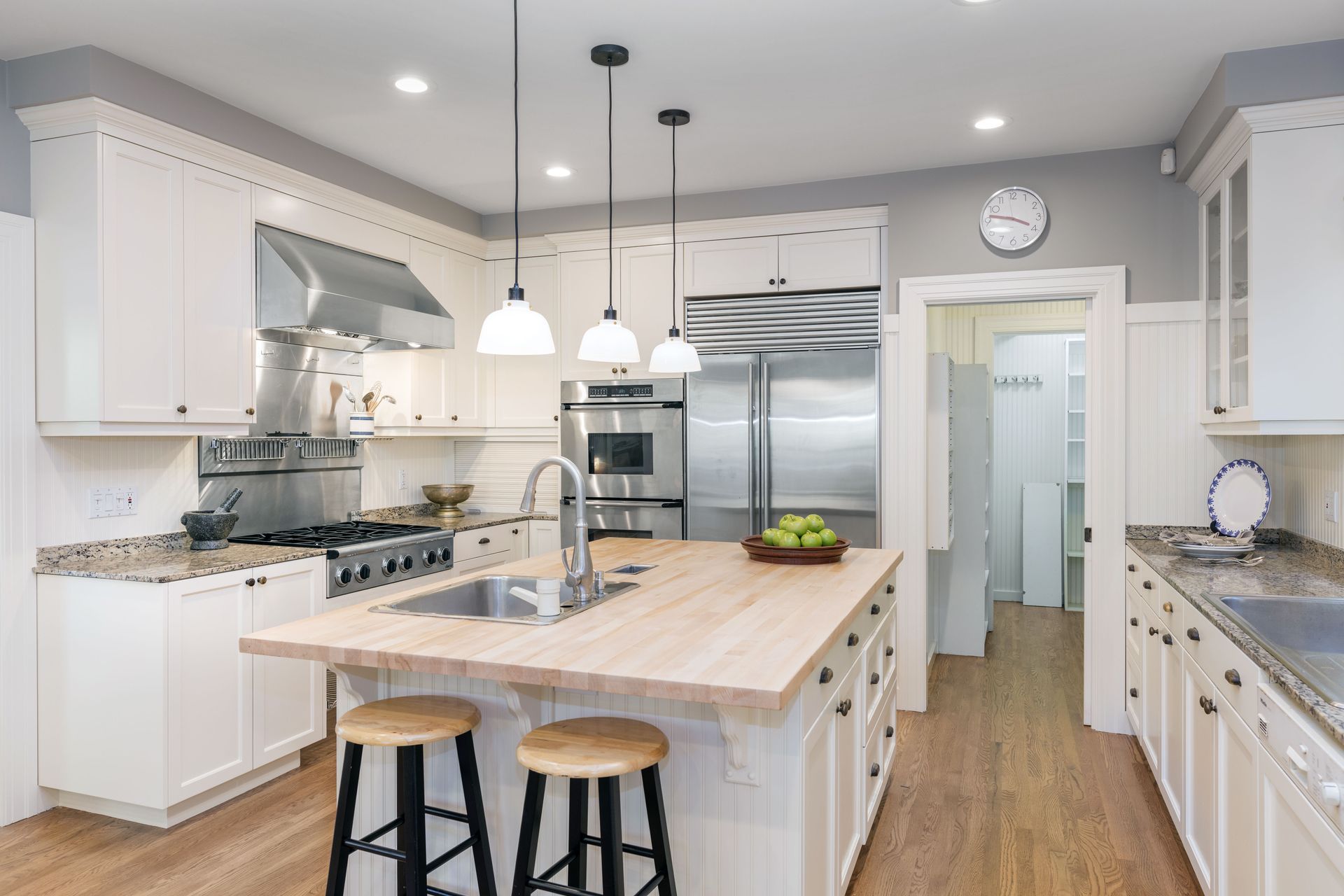
Neutral does not have to mean boring. You can add personality through hardware, lighting fixtures, and decorative accents while keeping the large surfaces classic. According to Houzz, white remains the top choice for upgraded kitchen cabinets, with 33% of homeowners opting for it in 2024. This preference for a crisp, clean look highlights the enduring appeal of bright spaces that feel hygienic and welcoming. Choosing a classic base allows you great flexibility if you decide to change your wall color or decor in the future.
Balancing Two-Tone Combinations
If you find yourself torn between two different shades, a two-tone approach might be the perfect solution. This design technique usually involves using a darker color for the lower cabinets or the island and a lighter color for the upper cabinets. This strategy grounds the room and creates a focal point without making the entire space feel too heavy. It is a fantastic way to introduce a pop of color while maintaining the brightness that upper cabinets in lighter shades provide.
Professional cabinet designers frequently recommend this layout for homeowners who want a modern edge. To make this look successful, keep the following tips in mind:
- Keep the darker shade on the bottom to maintain a sense of balance.
- Use the same hardware throughout to tie the two colors together.
- Select colors with similar undertones to ensure they do not clash.
- Consider using a wood stain for the island and paint for the perimeter.
Evaluating Finish and Durability
The color you choose is only as good as the finish that protects it. Kitchens are high-traffic areas prone to grease, steam, and spills. A matte finish offers a contemporary, velvety look but can sometimes show fingerprints and stains more easily than other options. On the other hand, a semi-gloss or satin finish provides a subtle sheen that reflects light and is generally much easier to wipe clean, making it a favorite for busy households.
When consulting with cabinet designers, ask about the type of paint or lacquer being used. Factory-applied finishes are often more durable than those painted on-site because they are cured in controlled environments. This ensures the color remains vibrant and resistant to chipping over time. Your color choice should be paired with a high-quality topcoat that can withstand the daily rigors of cooking and cleaning, ensuring your kitchen looks pristine for years to come.
Coordinating With Hardware Choices
The jewelry of your kitchen — the knobs, pulls, and hinges — can completely transform the appearance of your chosen cabinet color. A simple white cabinet takes on a traditional feel when paired with polished brass, but it shifts toward an industrial look when paired with matte black steel. The contrast between the cabinet surface and the metal finish creates visual interest and can help accentuate the specific undertones of the paint.
Consider these popular pairings that cabinet designers often utilize to enhance a space:
- Navy blue cabinets paired with warm gold or copper hardware.
- Forest green cabinets accented by brushed nickel or silver.
- Grey cabinetry complemented by champagne bronze or chrome.
- Natural oak wood paired with antique iron or dark bronze.
By thinking about these details early in the planning stage, you can ensure that the final result is a harmonious blend of color and metal. The hardware should serve as the finishing touch that brings your entire vision to life, reflecting your personal style through every small detail.
Ultimately, the best color for your kitchen is the one that makes you feel at home. Whether you prefer the timeless elegance of a bright white or the moody sophistication of a deep forest green, the goal is to create a space that functions well and brings you joy. Taking the time to research, test samples, and speak with cabinet designers will help you avoid common pitfalls and achieve a professional result.
A well-designed kitchen is an investment in your lifestyle and your property value, so choose a palette that speaks to your heart and stands the test of time. For expert guidance on your next renovation project and to see your dream kitchen come to life, contact BTO Cabinet & Design.